For the first time after the availability of pre-release versions of Windows 8, I took the time to download the Release Preview, install it in a VirtualBox machine (not without some problems) and use it. It indeed looks very good.
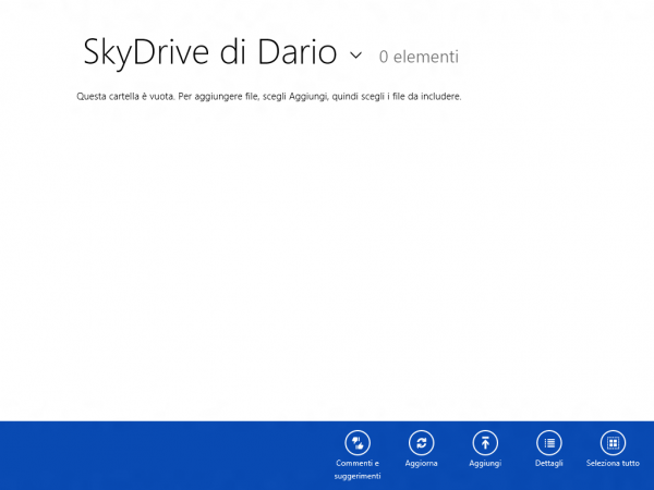
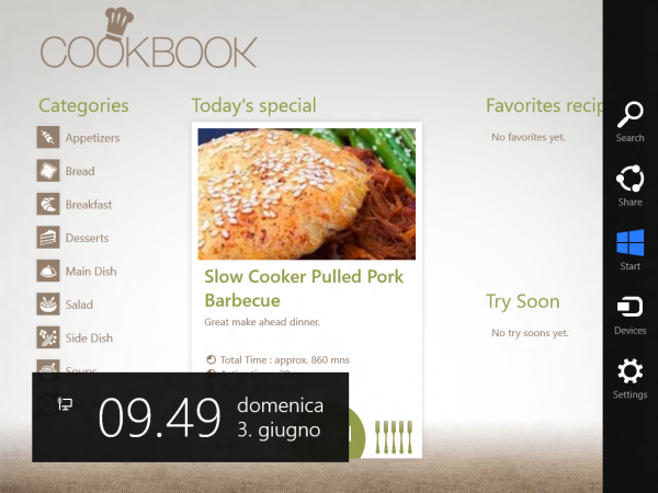
The first thing I noticed is that while the system is in English, Metro apps show up in Italian while the rest of the system, as we’ll see later, is still in English. I’m pretty sure this is done on purpose and it’s slightly annoying.
The second thing I noticed is that there’s no way to know how to actually use the OS. No hints, no first start tutorials, nothing. I started hitting random keys, and I discovered that the Windows key lets you… do something. It depends on where you are. The familiar ALT+TAB and WIN+TAB allow to switch apps, but who on Earth actually uses them?
I would have expected a first-start tutorial on how to use the new interface, very much like Android’s. Tap here to open the apps list. Swipe to change home screen. And so on. I would have expected to see such tutorial, instrumented with something that allowed Microsoft to measure users’ reaction. But no, you’re left to your own devices and the first thing you feel is disorientation.
Where do I click now?
Apparently, right-clicking inside an app opens some kind of context menu, only it’s either on the top or bottom of screen, thus very far from where your mouse pointer is. First usability issue.
It took me a search in Google to discover that moving the mouse pointer to a magic area somewhere on the bottom-right of the screen opened up some kind of system menu.
You see, we’re so used to mouse pointers that we’ve become very accurate with them. We’re pixel snipers. Windows 8 seems to ignore this, and presents you with huge buttons and icons, obviously designed as finger-sized.
Also, horizontal scrolling? With the mouse wheel? It’s so counter-intuitive that it’s almost criminal.
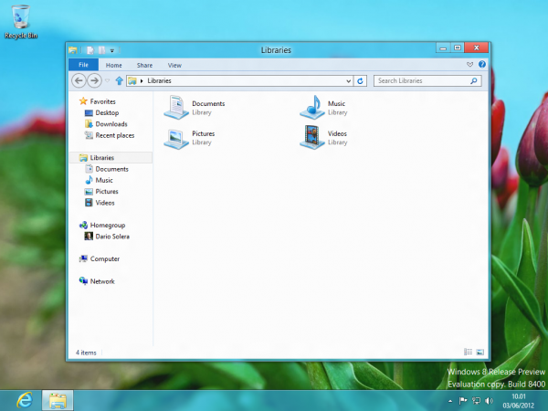
Wait, I can still use the good ol’ regular desktop!
Everyone knows this by now: when you’re in the classic desktop there’s no Start button.
Let’s ignore for a moment that the new chrome is somewhat ugly. Let’s just consider the usability of the new Start button (or lack thereof).
To open the Start menu in Windows 7, you just slam your cursor in the bottom-left corner of the screen and click. The menu pops up.
From previous steps, you learned that to open the Start screen in Windows 8 you have to slam your cursor in the bottom-right corner, and wait for about a second. Then you have to move the cursor up, to about half-screen height, and then click. The Start screen is displayed.
Moreover:
- the “magic” area that activates the new menu is much smaller than before, around 1/4 of the area of Windows 7’s Start button (half width and height)
- if you click there, nothing happens (actually, if the menu was already visible, it disappears, going once more against another established rule of Windows’ menus).
Wait a second, what happens if I move the pointer where the Start menu used to be?
Nothing more than this pathetic little icon popping up, which when clicked opens the Start screen:
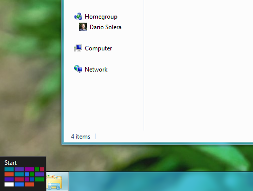
So there are two ways to open the new Start screen. In this case, the “magic” area is even smaller, only a few pixels wide. It’s insane.
This can’t be true.
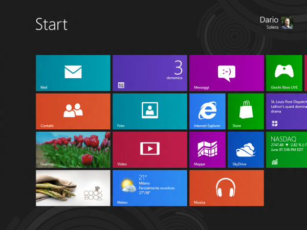
If you start typing something in the Start screen, the system searches through installed applications, very much like Windows Vista and 7 (which is very convenient). The problem is, if an application is not pinned to the Start screen, to reach it you have to either:
- start typing its name (right in the Start screen)
- click on the Search icon (intuitive, eh?), unfocus the auto-focused search box, and scroll all the way to the right.
I repeat, I’m sure it’s a great tablet OS, but for the rest of us who use a computer, either desktop or notebook, Windows 8 feels like several steps backwards in terms of usability – which can be described as:
An object is usable if it functions and behaves as the user expects.
It’s very subjective, but it’s also very simple, and particularly valid in this case. Windows has worked pretty much the same way for the past 20 years. Sure, with XP, Vista and 7 Microsoft introduced several changes, improvements and innovations, but nothing so dramatic like removing the Start button. It might seem a small problem, but it’s not, especially if it takes twice the time to get (almost) the same result.
In other words, to give tablet users a better experience, Microsoft is punishing desktop users. If you think about it, it’s so absurd it must be a prank. But it’s not.
Would you use Windows 7 on a 10-inch tablet? Probably not. Would you use Windows Phone 7 on a 22-inch desktop? Absolutely not. Despite this obvious observation, Microsoft decided to merge the two experiences together, producing an unusable scary monster, full of breaking changes to the user experience and with no advantage whatsoever over Windows 7 for regular desktop users (that is, like, 99% of Microsoft’s customer).
Microsoft is trying to build a bridge between 2 separated worlds, which would be nice if only could be an optional choice. Instead, you’re forced to live in both worlds at the same time, and every time you move from one to the another it’s – WHAAM! – a huge context switch. And we humans are bad at switching contexts.
I honestly wonder what are the reasons behind these decisions. Was it so hard to provide non-tablet users with a familiar experience? Or, even simpler, was it so hard to keep the old Start menu in place?
We all know it wasn’t hard. So why?
The only reason I can think of is simple, and yet scary: Windows 8 is not meant for desktops, it’s meant for tablets, whose users are expected to use the classic desktop sparingly (ideally never).
Screw desktop users, all we want is tablets.
Microsoft is actively killing the desktop as we know it. Is it good or bad? Only time will tell, but at the beginning people will surely freak out, and for me it’s the first time I’m not sure I’ll upgrade. Actually, I’m quite sure I’ll stick with Windows 7.
On a side note, Windows Store looks very nice, despite being painfully slow and having no obvious way to search for applications (apparently the Search tool is contextual). It’s only, like, 5 years late.

Comments
One response to “Windows 8 Frightens Me”
[…] I was tempted to buy a Nexus 7. The price is so low it’s almost at impulse-buy level, but I figured I should wait to see the first Windows RT tablets in October, despite being scared by Windows 8. […]