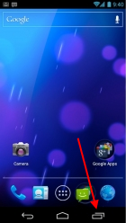
 One thing that I don’t get about Android 4 (a.k.a. Ice Cream Sandwich a.k.a. ICS) is the recent apps list button. I mean, it’s a nice thing to have, but does it deserve a dedicated button always visible in the UI? I don’t think so.
There is a major flaw about the feature itself, which is that it’s hard to navigate. The list gets very long in a very short time and often contains useless entries or apps you seldom use. In other words, it’s much faster to simply skim through the regular apps icons.
There is, however, another more subtle problem about the recent apps list. You see, to use it you must remember if you have recently used the app you want to run now. Which is close to impossible and defeats the very idea of having a smartphone. You shouldn’t be remembering things. That’s the phone’s job.
The only scenario in which this feature seems useful is to quickly switch between 2 or 3 apps that, for some reason, you’re using together or at the same time. Honestly I doubt it’s something that happens often.
So, a dedicated “hard” button? No way. It’s a waste if screen real estate which becomes blatant when you try to use the tiny “…” button to open the current app’s menu. Because the “hard” buttons area must have room for 3 buttons, the menu button is crammed into a handful of pixels at the bottom-right corner of the screen, so to press it you have to bend your thumb at an impossible angle (if you’re right-handed). I liked the old Android 2.x style much better: press and hold the home button to get a very concise list of recent apps.
