
The thing about CreateSpace is that seeing your work printed in actual (recycled?) paper, holding it in your hands, even smelling it, is wonderful. It’s something puerile, I concede that, but for one like me who is used to work with immaterial things – software, mostly – seeing the result of my intellectual work come into the physical, real world, peering outside a computer monitor, is unusual.
Going back to more concrete topics, I had initially ordered a 6×9″ printed proof from CreateSpace, with cream paper and glossy cover finish. The cover itself had a few details to tweak: mostly, the White Dwarf One mission emblem was a bit too large, so I reduced it to a more standard 4″ diameter.
Obviously, I couldn’t just make the changes and sit there idle, so I ordered another proof with the revised cover and a matte finish.
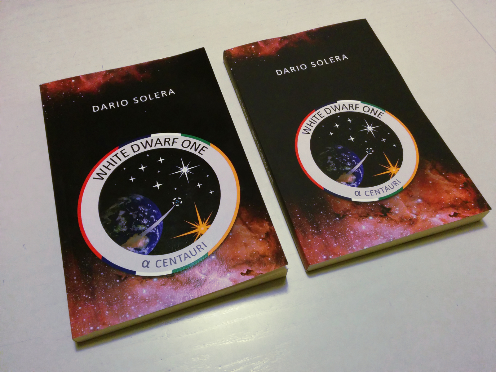
The glossy finish is rather obvious. It’s something everyone is used to. My opinion, however, is that the 6×9″ format, plus the glossy cover, turns the book into something that is somewhat close to a technical book or a manual. Blacks are very deep.
The matte finish is, I would say, unexpected. It feels like the rubbery finish of some smartphones, for example the Nexus 5. It is strange, and it’s unlike any other matte finish I have seen so far. It doesn’t feel bad, it just feels different. Colors are brighter and better.
Initially I thought that fingerprints, scratches, and dirt were very noticeable on the glossy finish… until I saw the matte cover.
So, which one should I choose? If I could, I would let the readers decide for themselves, but that’s not possible. That said, I think I will stick with the glossy finish, as it is closer to everyone’s expectations. Matte is cool and particular, but it’s just too particular.
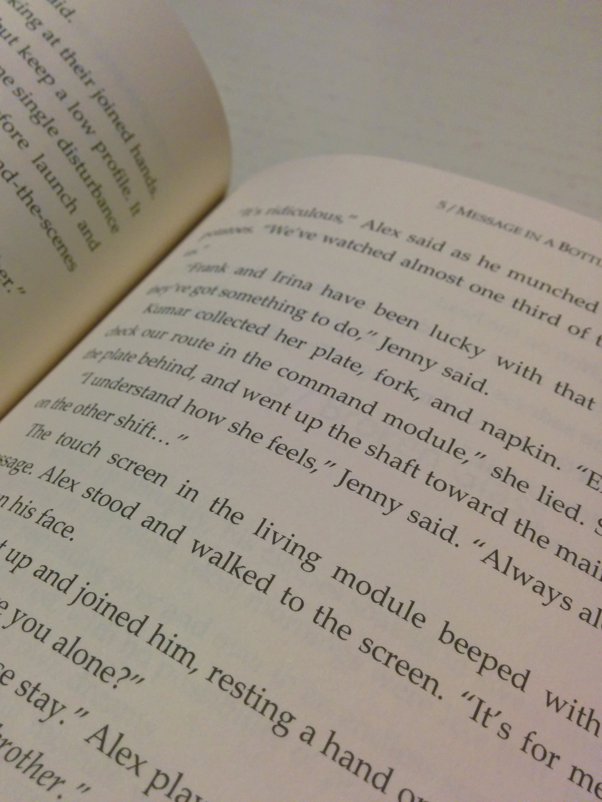
Despite the poor smartphone picture, taken with terrible fluorescent light, you should appreciate the crisp text. I am honestly surprised at how clear and sharp the words are. The font I chose is Palatino Linotype 11pt and I think it’s perfect.
All in all, the printed book looks real – legit, even. Awesome. Now, the only problem is selling three or four copies: that would be an achievement.